Dashboard Is Not a Decoration: How to Make Profit Data Truly "Alive" in Your Team's Daily Work
Many managers, when talking about "digital transformation" or "profit visualization," have a misconception: as long as we hang a big screen in the office or send an Excel screenshot in the group every day, the data is doing its job.
But I have to be blunt: if the data can't change what the team does on a Tuesday afternoon, then it's nothing but a pile of meaningless digital garbage.
From "Data Anxiety" to "Data Decision-Making": A Real Lesson
In Q3 2023, on a Tuesday afternoon, I sat in the office of a distribution center in East China, looking at the freshly printed weekly report, feeling an inexplicable sense of frustration.
That week, the gross profit of our tobacco category had declined for 1.5 percentage points consecutively, especially for those high-margin, long-cycle products. As usual, we were going to have a meeting to discuss it. But the problem was that everyone in the meeting was always talking about "I think the market environment is bad" or "the competitors are running promotions." No one could accurately say: was it because inventory turnover had slowed, or because the quota for some key product hadn't kept up?
Back then, although we had data, the data was "dead." It sat in the finance department's system, or was locked away in some manager's complex Excel spreadsheet. We either waited for last week's data or last month's statements. This lag turned so-called "visualization" into "Monday morning quarterbacking."
Don't Be Blinded by Complex Metrics: I Only Watch These Three
After experiencing that profit decline, I realized that what we needed wasn't to build a massive BI system, but to establish a "daily pulse."
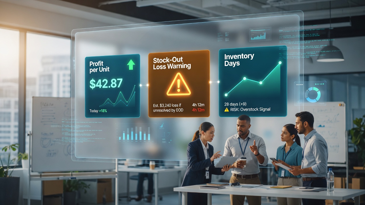
Many teams try to display 50 metrics on a dashboard, with the result that no one looks at it. The hard rule I set for my team is: The dashboard can only have three core metrics, and they must be automatically pushed to everyone's workspace before the morning meeting.
Don't just look at total profit. Total profit can be deceiving. If you sold 100,000 cases of cigarettes, but the profit is entirely supported by low-margin volume products, your business structure is very fragile. What we need to see is the profit contribution from each action.
In the tobacco industry, stock-outs mean direct profit loss. We need the dashboard to directly show: if these three core high-margin products run out of stock today, how much money will we lose? This number must be real-time.
Profit trapped in inventory is the biggest waste. If the inventory turnover days increase for three consecutive days, even if profit looks like it's still growing, I consider it a danger signal.
Solving the "Data Trust Crisis": Transparency Matters More Than Accuracy
In the process of promoting the dashboard, the biggest resistance I encountered wasn't technology, but people.
At that time, frontline sales feedback was: "The data in the system is wrong. There's clearly still stock in the warehouse, but the dashboard shows out of stock?" Once this kind of doubt took hold, the dashboard was completely useless.
I didn't choose to fix the perfect algorithm. Instead, I took an extreme approach: We also visualized the "reconciliation process" of the data source. We added an "anomaly labeling area" below the dashboard, allowing warehouse managers and salespeople to tag it in real time.
"The warehouse is doing inventory count; data may have a 2-hour delay" — when this kind of transparent information was displayed, the team stopped obsessing over absolute accuracy and started focusing on data "trends." We stopped arguing about whether the data was right, and started discussing: "Since the stock-out warning has come out, how should we adjust our quota tomorrow?"
Conclusion: The Essence of a Dashboard Is "Behavior-Driven"
Profit visualization is not for the boss to see; it's for the front line to see.
A good profit dashboard should make an ordinary sales representative, when seeing the numbers change, feel a sense of urgency: "The gross profit of this product dropped today; I need to check if there's a quota problem."
Remember, if you can't use the dashboard to change your team's behavior, then all the effort you've invested is just doing an expensive form of visual art.